Welcome to my pet and family portrait blog. If you have commissioned a portrait you can see how it is progressing. If you would like to commission me to paint your pet, family or friend then visit my site at www.katetugwellportraits.com
Fancy learning how to draw and paint? See my art classes website at www.katesartclasses.com


Wednesday, 16 July 2014

Sidney


My latest pastel portrait is of a very sleepy dog called Sidney. I did a portrait of another sleepy dog of theirs called Daisy and they have come back again, this time wanting a special birthday gift. I sketched the basics onto an A4 sized grey Velour Pastel Paper then picked a white pastel to block in the shine on his coat. I used oranges and browns to block in other areas of colour especially on his ginger fringe which apparently is his main feature! I worked on the picture with other brown pastels, picking out subtle shade changes, and then put black into the shadow areas. The final picture in the series is a bit of a leap as lots of details have been put in including the eyes, with pastel pencils. Shades of green and blue have been added to enhance the red/orange hues and finally a hint of the sofa Sidney is snoozing on is hinted at! It's a dogs' life...

Saturday, 28 June 2014

Three Golden Retrievers


These three canine friends are now complete - layers of pastel have been applied over a period of days. Following on from the last blog entry, as I had already laid the base foundation of colour, I took my black pastel and focussed attention on the dogs' faces. I spent time making sure I captured the character and getting their features down accurately. I also used brown and grey pastel pencils to pick out the highlights. I used pinks, reds, purples and browns on their tongues and took care not to smudge the black to totally change the expression on each face. The next stage was to look at the general highlights and shadows so I put marks into the shadows using a dark brown pastel and white and cream for the light areas. I smudged in dark shadows under the dogs and having decided not to get more photos of their paws or introduce green grass, I created a texture for them to stand on that used the same colours as their coats. The last stage involves assessing the picture as a whole, adding more texture, balancing tonal values and sharpening up details. I'll look at it again tomorrow but I've signed it off as finished.

Monday, 23 June 2014

Three Golden Retrievers


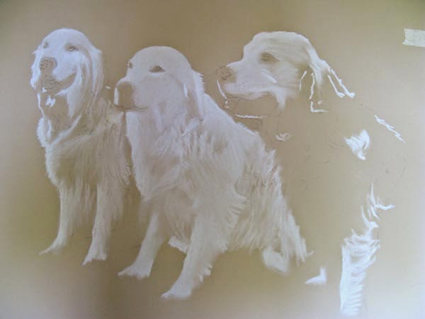
This latest commission is of three Golden Retrievers: Georgie on the left, Walton in the middle and Wilson on the right. It is to be undertaken with pastel on size 18 x 24" Canson MiTientes Pastel Paper. The first stage was to sketch the dogs onto the paper, I moved Wilson further in to make a more balanced composition and, once I had a likeness, set about putting white pastel into the main areas of light. Next, I took a dark brown pastel and blocked in the main areas of dark, blending the pastel as I worked into the tooth of the paper but trying not to blur the edges too much. After establishing the darkest and lightest areas, the next stage is colour. I used a warm yellow and terracotta pastels to block in the main areas as I can see them, working from left to right and placing marks in the direction of the fur, which gets pretty curly on Wilson! In the latest stage I put some cool colours into the shadows which has the effect of warming up the golds. I chose green and a blue/grey and smudged it all in. That's the base layer done, now for the details...

Monday, 12 May 2014

The Sherwoods Family Portrait

The portrait of these three siblings is now finished. Since the last blog entry I have been working more colours onto the two sister's faces, blending each layer, taking care not to lose the main features as the skin tones are merged. Teeth are the hardest to get right as they need shaping and colouring very precisely otherwise they can easily look crooked, rotten or bleached and I had to imagine what Luke's teeth might look like without his brace. When the picture gets to this stage I work on all three faces together to ensure they all belong with each other and don't look like individual portraits. I work my way through the spectrum of colours, picking a pastel pencil and marking each face where I see that colour before, choosing another pencil. Finally, the smallest adjustments are made to shapes, colours and tones of eyes, noses, mouths and hair strands, with purples and browns used to darken the shadows.

Thursday, 24 April 2014

The Sherwoods - a family portrait in pastel


This latest portrait is a surprise 50th birthday present for the proud father of these three siblings, commissioned by his wife, so shhhhh, don't tell him! The photos were taken on the same day in the same room so the light source is the same and despite there being other photos of them all together, the favoured expressions are of them separate from each other. I put together the composition in Photoshop so they could all agree and then drew each of them onto a 16 x 19.5" sheet of Ingres cream pastel paper. When I was happy with the likeness I started blocking in the main colours in Luke's face and hair, blending together various shades of pink, orange tones and brown. His eyes are very green at this point and the brace on his teeth is not being painted in so his teeth look brilliant white. When the first two or three layers were laid down and blended in I moved onto Anna's hair and face, again blocking in the main areas of colour and tone. There's not much detail at this stage but attention still has to be paid to the shapes in the face as the drawing gradually disappears under the layers of pastel. You can see at each stage that I've been revisiting Luke's face, as working on other areas, leaving the painting and returning, refreshes my eyes. I can immediately see where improvements are needed and by working from the top down I reduce the risk of smudging the painting too much. I have taken a couple more pictures of the process with Laura's face, so you can see the pale pink and white of her skin on the first layer being worked in, before the shadows are placed. The start of any painting is exciting as the blank paper is transformed with the first few layers of pastel. Now comes the tricky bit of making them really come to life! Watch this space...

Thursday, 17 April 2014

Portrait of Tom


Hooray! The portrait of Tom is finally complete and ready for the Easter break. I'm really pleased with it now but it has been a battle: I had trouble with the shirt as the original photo had his shoulder up, causing the shirt to crease in a way that looked wrong with the shoulder down. Tom had kindly sent lots of photos of him in different shirts but I wanted the colours to complement the portrait I previously painted of Linda. A plain shirt looked too plain so I opted for a green check and ended up re-painting the lines about five times. I even resorted to getting my husband to model a stripy shirt for me so I could work out how the creases fell and how the contours of the check pattern would work. That'll teach me!! Obviously the main part of the portrait is Tom's face and particularly his eyes so most of the glazed layers of paint went into his face - the shadows and laughter lines. This goes through a process of darkening areas then smoothing them into the surrounding area using a series of scumble glazes. These glazes range from bright purple, red and orange to dark brown, grey and green. Green works surprisingly well in the shadows although it looks pretty scary when first applied - Tom was the Incredible Hulk for a time! It has been sitting on my easel for a while as I have been tweaking the background, the shirt, adding a few more grey hairs to Tom (and to me) but I'm really pleased with the final outcome and hope Tom feels the same.

Monday, 10 March 2014

Maude - wire haired dachshund pastel


This is Maude, a wire haired dachshund, who lives on the other side of Chichester. Her owners didn't have many photos of her so as part of the commission, I took my camera and we encouraged her to pose in the comfort of her own home. She was very compliant (especially when bribed with a few treats!). I chose a dark cream Ingres pastel paper size 12x16" and sketched her features in graphite. Then using a white and cream pastel I blocked in the areas that had the most light, then took a brown and black pastel and blocked in the darkest areas. I like to concentrate on the eyes early on in the painting as they are crucial to finding a likeness. The first few layers of pastel were smudged into the background and the process repeated, this time adding browns, ochres, oranges and greys. Once happy with the general look I reached for my pastel pencils to put the finer details of the coat and individual hairs to complete the portrait.